Rebranding Luxor
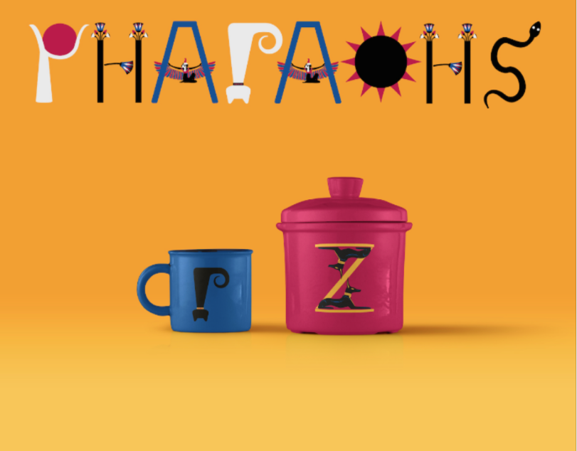
The city of Luxor is an open air museum. It was known to the ancient Egyptians as the capital of the world. Egyptian had a theory that Luxor was where all life had started. The word Luxor originally comes from “the palaces”. It welcomes millions of tourists from all over the world to come and witness the magic that stands on and below the ground. The rebranding of Luxor aimed to change the perception of the youth towards history. It aims to connects history, present and future. Our graphical language achieves the concept by designing a logo mark that is a fusion between the hieroglyphs writing system and our modern scripts. In addition to the dynamic and vivid colour scheme inspired from their original pigments which exist in some of the temples still standing. The colourful identity aims to focus on the richness of the heritage and vibrancy of the people of present Luxor. The strength of the history of Luxor is presented in the image style and pictograms. The pictograms are

